Are users dismissing your product tour on the first or second card? The product tour UI and the user experience it helps to form are key to success not just for the product tours themselves but often for the entire SaaS platform. The first moments may determine whether most users go through the whole product tour or at least through parts that will benefit them most. This will increase the likelihood of their onboarding success, enjoyment from using your product, or conversion to a paid or higher-tier version.
Already using product tours? If not, try Product Fruits 🍇 free for 14 days and experience our product tours firsthand. 💫
Wait, what is a Product Tour?
If you stumbled upon our blog while looking for general onboarding best practices, hold on a little longer. This might also be for you, as you are looking for ways to make life for your users or customers easier or impress them.
The first few minutes of user experience with a new SaaS often decide whether the user (or the user and the entire team behind him or her) will stick or not. A Product Tour (sometimes also called “product flow”) is a guided walkthrough that introduces new users to the core features and benefits of a digital product, such as a cloud app or a web platform. It acts like a virtual hand-holding experience, showing users around and highlighting essential functions to help them quickly understand how to get the most out of the product.
You can easily add product tours and other tools to improve user onboarding and retention to your SaaS product or website using product tour software – an onboarding platform (also called Digital adoption platform – DAP), such as Product Fruits. A picture is worth a thousand words, so see it in a short video:
7+1 takeaways from 5 platforms – summarized
So, what will you take away from this blog post? We have boiled it down to seven takeaways. Here is the shortlist or tasting menu. Enjoy the SaaS examples and full takeaway servings below.
- User onboarding experience is more than just a product tour. Make tour no more and no less than a seamless logical part.
- Combine a tour and SaaS functionality—this logically follows the first takeaway. By combining a SaaS product with an onboarding platform, you immediately invite users to use your product as part of the tour interaction.
- Keep Tours Short: Limit product tours to 3-5 cards at most. Sometimes, 1-2 might be just enough.
- Focus on Clarity: Convey your message using simple language and clear visuals. Users should be captivated and informed at the same time.
- Add Personality: Use relatable content and cheerful humor to make the experience enjoyable. Make sure such content or visuals are kind and apropriate for all users.
- Make It Interactive: Engage users with interactive elements that allow them to experience key features firsthand.
- Integrate Other Tools: Use hints, a user onboarding checklist, a knowledge base, or similar tools to support customers throughout their user journey.
- Seek User Feedback: Use onboarding and tour analytics and encourage users to continually share their thoughts to improve the user onboarding process.
Read on, or try building some product tour examples, welcome tours, or other onboarding and adoption content for your SaaS now with Product Fruits. The first two weeks are free — on us. Just register here.
Best Practices for a Great User Onboarding Experience
So you’ve built a fantastic SaaS product with tons of cool features, but how do you get new users to understand and love it as much as you do? How about telling them all the great things about functions, key features, and possibilities your platform offers – in a detailed welcome tour with fancy visuals, videos, and a walkthrough of all the essential menu items?
Well, no.
What you really want to do is to make the user experience in the onboarding (registering, setting up, and first use steps) and early adoption (completing first tasks) phases as seamless and hindrance-free as possible. Product tours can and should be part of this, but as our experience in onboarding to trial versions of five top SaaS platforms shows, there is more to great onboarding and adoption user experience than just a fancy product tour. But lets have a look at those examples first.
Five product tour UI examples from top SaaS platforms
In our previous posts, we already covered best practices for product tours and how to start with product tours and walkthroughs. This time, we explored the user onboarding processes of five prominent SaaS platforms—Slack, Canva, Asana, Notion, and GitHub—by creating new free accounts and experiencing their introductory product tours (welcome tours) firsthand. Here’s a detailed look at how each platform approaches product tour UI and other best practices to enhance user onboarding.
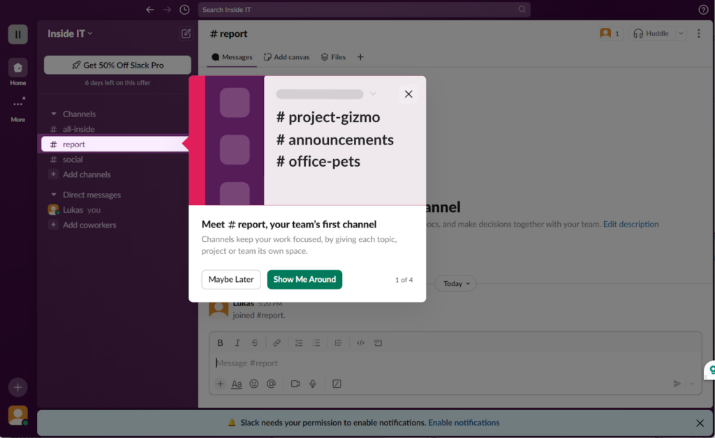
Slack: Seamless Onboarding Integration
Slack demonstrates a smart integration of its platform features with a 4-card introductory product tour. The process begins by asking new users for basic information such as email, company or team name, current project or topic, and colleagues to invite to the workspace. This ensures that by the time the user reaches the workspace, it is already set up with essential details, making the experience feel personal and ready to use.
At this point, the first product tour begins, walking users through core features like channels, direct messaging, and file sharing. The tour is brief, engaging, and uses friendly language, making the onboarding process feel like a casual conversation. Most importantly, users can start using Slack immediately without being hindered by lengthy explanations or steps.
Top Tip: Slack’s onboarding is further streamlined by its unique account creation process. Users don’t need to set up a password initially. Instead, a verification code sent to their email activates the account, making the signup process quicker and more user-friendly. As we will see, this is quite a common approach today.
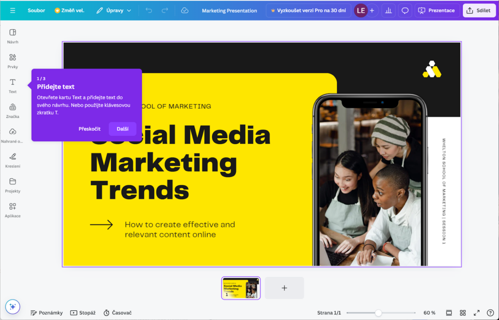
Canva: Contextual and Minimalist Tours
Canva’s onboarding experience starts with a somewhat overwhelming range of sign-in options—eight, including Apple, Google, Facebook, Microsoft, various emails, and even mobile numbers. While this flexibility covers all bases, it can confuse users unsure of which method to choose.
Once through the authentication process, which involves email verification similar to Slack, Canva attempts to upsell users by disguising a “subscribe” button as “next.” While we understand the advantage of signing up users already with their credit card details or converting them right away (getting more determined users rather than just more users), doing so with “button tricks” is awkward. Thankfully, if users bypass this with a “maybe later” button lurking in the corner, they are rewarded with a well-designed product tour UI and overall onboarding experience. Canva’s tours are minimal, context-sensitive, and typically consist of 1-3 cards triggered by user actions, such as selecting a template or starting a project. This efficient, on-demand approach ensures that the product tours are relevant and non-intrusive.
Top Tip: Canva’s product tours are localized in various languages (see screenshot in Czech?), enhancing accessibility for non-English speakers and ensuring users can interact with the platform in their preferred language.
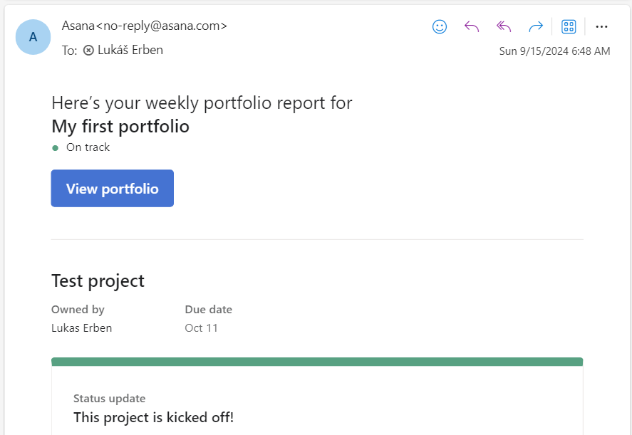
Asana: Structured Onboarding Process with Some Hurdles
Asana’s onboarding is similar to Slack’s but includes additional steps, such as setting a password after email verification. It then asks questions about the user’s project and critical tasks, creating a workspace tailored to their needs. The welcome tour, illustrated with visuals that complement the SaaS interface, follows. However, the tour lacks interactivity, making it less engaging for users who prefer hands-on learning.
While Asana’s initial onboarding feels comprehensive, it could be streamlined further. For example, the need to confirm password saving in the browser and other minor steps create friction that can be reduced. Moreover, the follow-up communications, like weekly summaries, might not be ideally timed, as receiving such updates early on a Sunday morning may not suit all users.
Top Tip: Timing is crucial in user interactions. Ensure that follow-up communications, such as reminders and reports, are scheduled optimally to avoid becoming a nuisance.
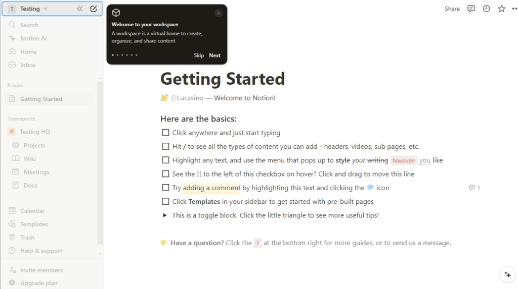
Notion: Interactive and Personal Onboarding
Notion’s onboarding experience is a blend of quick setup and interactive learning. After account creation, users answer questions to customize their workspace—whether for personal use or business and individual or team projects. Although Notion tries to upsell a two-week free trial of its Plus plan even before you start using it (akin to Canva), the initial product tour is straightforward, using a 6-card sequence to introduce essential menu items and functions.
A unique feature of Notion’s onboarding and product tour UI is the interactive task list, created directly in the user’s private platform section. This approach not only familiarizes users with Notion’s task management but also allows them to revisit and complete the list at their own pace.
Top Tip: Notion’s non-automated “Getting Started” checklist encourages users to engage actively with the platform. It teaches users the basics while also providing a resource they can return to as needed, as it is stored as the first item in their private section.
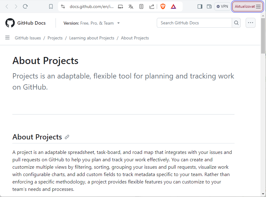
GitHub: Tailored Onboarding User Journey for Developers
GitHub, a platform beloved by developers, starts its onboarding with a touch of geeky charm. The welcome text on the signup screen is animated, appearing letter by letter—a subtle nod to the coding world and IT history. After the initial setup, an upsell screen appears, but it’s less aggressive compared to other platforms. You are then invited to set up your personal profile (readme.md); again, all is somewhat geeky and conjured up a satisfied grin on our faces. Things like having a “commit changes” button (instead of ordinary “save changes”) to save/create your profile are making life happier and better, little by little.
GitHub’s product tours are minimal and only appear when users access specific site sections, such as Projects. Instead of overwhelming users with information, GitHub provides succinct, one-card tours with links to detailed documentation, perfectly catering to its more experienced audience.
Top Tip: Consider your user base’s experience level when designing onboarding content. GitHub’s sparse, context-specific product tours work well for technically savvy users who probably prefer to explore features independently.
Why not build a product or welcome tour for your platform with Product Fruits now? Or use it to start building your Knowledge base if your SaaS lacks functionality. The first two weeks are free—on us! Just register here.
Seven Plus One Takeaways on Product Tour UI
Let’s delve deeper into the key insights we’ve gathered from observing how top SaaS platforms use their own interactive product tours (or welcome tours) and relate these findings to our own experiences at Product Fruits
1. User Onboarding is More Than Just a Tour
Onboarding is a multi-step process that extends beyond a simple product tour UI. While the tour plays a pivotal role in familiarizing users with the platform, it is not sufficient on its own to ensure a seamless onboarding experience. You need to collect, create, and verify users’ basic credentials, set up their workspace, and guide them through your SaaS product’s key features and menu items. The product or welcome tour usually takes over at this final stage, briefly introducing the core functionality.
2. Combine the Tour with SaaS Interactions or Functions
This point naturally follows from the first takeaway. By integrating product tour UI elements with actual SaaS interactions, you create a more engaging experience. Instead of starting the tour immediately after login, consider triggering short, context-sensitive tours as users explore different areas of your platform. This approach ensures that the product tours are relevant and actionable, guiding users through complex or less intuitive features as they encounter them.
3. Make Product Tours Interactive
Welcome tours often rely heavily on text or video, which can cause users to passively receive information (and get bored) or skip the tour altogether. To combat this, make your tours interactive. Videos effectively demonstrate complex features but keep them brief—measured in seconds, not minutes. Combine these with cards that prompt user interaction. For example, ask users to complete a task or explore a feature during the tour. Consider where and how your users will experience the tour: will they be able to watch a video with sound, or would text and visual cues be more accessible?
4. Keep Product Tours Short
Our golden rule is to limit most tours, including welcome ones, to 4 to 5 cards. As illustrated in the examples above, sometimes even 1-2 cards are enough, especially when integrated with other well-designed onboarding elements. The amount of information you should convey in a tour also depends on your product type and audience. Are your users likely to be experienced, professionals or first-time users? Tailor the length and content of the tour accordingly to keep it relevant and engaging. You can also prepare follow-up product tours and launch them when users interact with a relevant part of your SaaS.
5. Focus on Clarity
Use simple language and clear visuals to communicate your message effectively. Many of your users might not be native speakers, and complex language could lead to confusion. Your goal is to keep users informed and captivated simultaneously. Clarity not only enhances comprehension but also reduces the cognitive load on users, allowing them to focus on exploring your product’s key features.
6. Add Personality
Incorporating relatable content and a touch of humor can make the onboarding experience more enjoyable. This, however, must be done with care to ensure that the tone and visuals are appropriate for all users. For instance, GitHub’s user onboarding process, which adds a coding feel to even basic interactions, resonates well with its developer audience. Personalizing your own product tour with small, thoughtful touches can create a positive and memorable user experience.
7. Integrate Other Tools
Creating interactive product tours are just one part of a comprehensive onboarding toolkit. Supplement them with hints, checklists, and knowledge bases. For instance, you can use user onboarding checklists to guide users through their initial setup or incorporate links to a knowledge base for more detailed explanations. This not only shortens the length of the product tour but also teaches users where to find answers independently, which can significantly reduce support requests and enhance user satisfaction.
+1. Seek Continuous User Feedback
Finally, the onboarding process should be continuously refined based on user feedback. Use analytics and metrics to monitor user interactions with the tour and other onboarding elements. Encourage users to share their thoughts through feedback forms or NPS surveys. This feedback loop will help you identify areas of improvement and adjust your onboarding strategy to meet user needs better.
Wrap-up
Creating an effective product tour UI is a delicate balance between guiding new users and allowing them to explore independently. By using tried-and-tested patterns, such as integrating interactive elements, maintaining clarity, and respecting users’ time with concise product tours, you set the stage for a successful user onboarding process. Remember, onboarding isn’t a one-time event but an evolving user journey that adapts to the needs of both new and existing users.
By taking inspiration from these top SaaS platforms and other resources like our knowledge base and applying these best practices to your onboarding process, you can craft a user journey that highlights key features and encourages deeper engagement and satisfaction with your product. At the end of the day, the ultimate goal is to create a welcoming environment where users feel supported and empowered to make the most of your platform.
Hopefully, you now know better what might work for the product or welcome tour in your SaaS. You actually do not need to create tons of content—and even the little you need can be generated by Product Fruits AI. The first two weeks are on us – free, including AI tokens. Register here.